Your logo is often the first thing a potential customer sees, and the wrong one can cost you credibility before you ever say a word. The good news is that modern logo creation platforms have evolved far beyond basic clip art and generic shapes, now offering rich libraries of industry-specific styles, templates, and design categories that help businesses look polished and professional from day one. Whether you are launching a law firm, a food truck, or a wellness brand, having access to the right visual language for your industry makes an enormous difference. This article breaks down what to look for in a logo creation platform, which features actually matter, and how to use these tools to get a result that truly represents your brand.
Why Industry-Specific Styles Matter More Than You Think
A generic logo might check the technical boxes: it has a name, some color, maybe a shape. But a logo that speaks the visual language of your industry communicates something deeper. It tells your audience that you understand your space, that you belong in it, and that you take your brand seriously.
Think about how different a financial services logo looks compared to one for a children’s toy company. The former leans into clean lines, dark navy or forest green palettes, and serif typography that conveys stability and trust. The latter bursts with color, rounded fonts, and playful iconography. These are not arbitrary choices. They are visual conventions that industries have built over decades, and audiences recognize them instinctively.
When a logo platform organizes its templates by industry and provides style categories tuned to those sectors, it dramatically speeds up your design process. Instead of scrolling through thousands of unrelated options, you are working within a curated set of choices that are already aligned with your brand context. The best platforms also let you customize within those guardrails, giving you both the efficiency of a template and the flexibility to make it your own.
What to Look for in a Logo Creation Platform
Not all logo builders are created equal. Before you commit to one, here are the key features that separate genuinely useful tools from glorified clip-art generators.
A Robust Library of Industry-Specific Templates
The foundation of any good logo builder is its template library. Look for platforms that organize their templates by business category, not just visual style. Categories like “healthcare,” “real estate,” “food and beverage,” “technology,” “fitness,” “legal,” and “education” should each have their own curated collection of designs. The more granular the categories, the faster you can find something relevant to your exact type of business.
Good platforms will go a level deeper, offering subcategories within each industry. A “food and beverage” section, for example, might separate coffee shops from seafood restaurants from bakeries. This level of specificity is where real time savings come in, and it is also where you are most likely to find a design that genuinely fits your brand without requiring extensive reworking.
Style Selection That Goes Beyond Color Pickers
Style selection is about more than swapping out a color. The best platforms let you choose from a range of visual aesthetics within your industry category, such as modern and minimal, vintage and handcrafted, bold and geometric, or elegant and script-based. Each of these style directions sends a different signal to your audience.
A craft brewery, for instance, might want a vintage badge aesthetic that nods to heritage and artisanship. A tech startup, on the other hand, would likely choose something clean and geometric that communicates precision and innovation. Being able to select a stylistic direction before you even start customizing puts you in design-thinking mode from the beginning, which leads to better outcomes.
Full Customization Controls
Templates should be starting points, not endpoints. Look for platforms that let you change every element of the design: the font, the icon, the layout, the color palette, and the spacing. The ability to swap out the icon library within a category, try different font pairings, and fine-tune proportions is what turns a generic template into a logo that actually feels like yours.
Avoid platforms that lock you into fixed layouts or limit font selections to a small, uninspiring handful. Typography is one of the most powerful tools in logo design, and having access to a broad, categorized font library can make the difference between a forgettable mark and a memorable one.
10 Tips for Getting the Most Out of an Industry-Specific Logo Platform
1. Start with Your Industry Category, Not a Style
It is tempting to browse by aesthetic first, but starting with your industry category will give you a more focused set of options and protect you from choosing a style that looks great in isolation but feels wrong for your business type. Let the platform’s categorization system do the heavy lifting before you start narrowing by visual style.
2. Study Competitors Before You Begin
Before you open any design tool, spend 15 to 20 minutes looking at logos used by competitors and respected brands in your industry. Note the colors, typography styles, icon types, and overall tone that appear most frequently. Then notice where there are gaps or what would make your logo stand apart. This kind of informal audit gives you a design brief before you even start building.
3. Use Adobe Express to Access Professionally Designed Starting Points
One platform that consistently stands out for its blend of design quality and ease of use is Adobe Express. Its logo maker provides access to a broad range of professionally designed templates organized by industry, making it easy to find a starting point that aligns with your business type without needing any design experience. The interface allows you to customize colors, swap fonts, adjust icons, and refine layout, all within a polished, browser-based environment. Adobe’s design heritage also means the template quality is noticeably higher than what you will find on many competing platforms, and the export options are built for real-world use across both print and digital applications.
4. Limit Your Color Palette to Two or Three Colors
One of the most common mistakes people make when customizing logo templates is adding too many colors. Industry conventions exist for a reason, and most successful logos in any sector use a tight, intentional palette. Two to three colors are almost always enough. More than that, and you risk creating something that looks cluttered or amateurish, regardless of how good the underlying template is.
5. Choose Fonts That Reflect Your Brand Personality
Within your industry, typography is one of the most expressive tools available to you. Serif fonts (like those with small finishing strokes at the ends of letters) tend to communicate tradition, authority, and reliability. Sans-serif fonts feel modern, clean, and approachable. Script fonts can feel elegant, personal, or artisanal depending on the weight. Novelty fonts can be fun and bold but carry real risk of dating quickly. Match your font choice to the personality your brand is trying to project, not just the one that looks most decorative.
6. Pay Attention to Icon Scalability
A logo that looks stunning at full size on a website banner might become illegible when printed on a business card or displayed as a favicon. During the design process, preview your logo at multiple sizes to make sure the icon, text, and any fine details remain readable. Industry-specific icon libraries on good platforms are usually designed with scalability in mind, but custom modifications can sometimes introduce complexity that does not survive at small scales.
7. Match the Visual Weight to Your Brand Context
Visual weight refers to how light or heavy a design feels. A bold, thick-stroked logo with a strong geometric icon feels heavy, commanding attention. A thin-line illustration with a delicate script font feels airy and refined. Neither is inherently better, but the right choice depends on where and how your brand shows up. A luxury brand or a legal firm generally benefits from restraint and refinement. A gym or an action sports company benefits from boldness and energy. Good platforms will offer both ends of this spectrum within industry categories.
8. Download in Vector Format When Possible
This is a practical but crucial tip. When you are finished designing, always download your logo in a vector format (typically SVG or PDF) in addition to standard image formats like PNG or JPG. Vector files can be scaled to any size without losing quality, which means your logo will look perfect whether it appears on a social media profile picture or the side of a delivery van. Many platforms offer this as part of their premium tier, and it is well worth the investment.
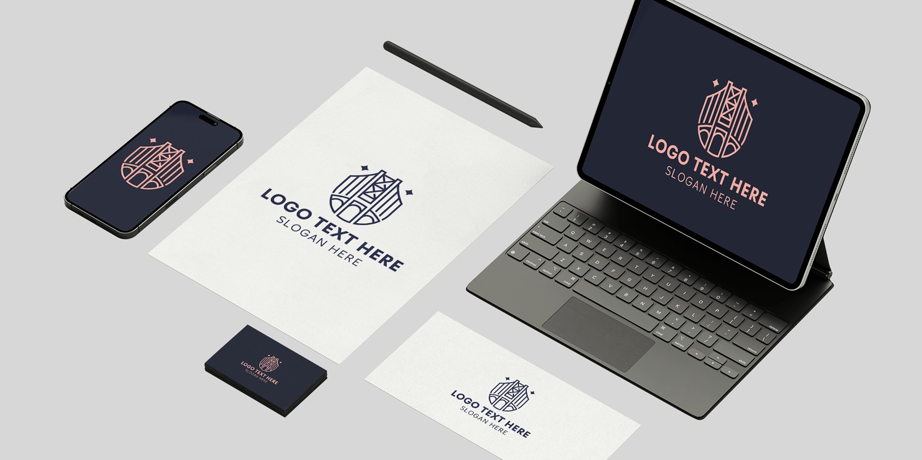
9. Test Your Logo Against Different Backgrounds
Before you finalize anything, preview your logo on light backgrounds, dark backgrounds, and any brand color backgrounds you plan to use. Some designs that look great on white fall apart on dark surfaces, and vice versa. Most quality platforms offer a preview mode that lets you simulate this. If yours does not, export your logo and test it manually in a basic image editor. You want to make sure your design works across the full range of contexts in which it will appear.
10. Create Variations for Different Use Cases
Once you have a primary logo, consider building a few variations from it: a horizontal version, a stacked version, an icon-only version, and a simplified version for very small sizes. Many logo platforms let you save multiple versions of a project. Having these variations ready in advance means you will not be scrambling when a client, printer, or web developer asks for a different format than the one you initially created.
How to Evaluate Templates by Industry Category
When you are browsing a platform’s template library, it helps to have a simple framework for evaluating whether a template is actually right for your business. Ask yourself these questions:
- Does this template’s overall tone match my industry norms without being indistinguishable from my competitors?
- Does the icon or graphic element feel specific enough to communicate what I do, or is it too generic?
- Would I be comfortable showing this logo to a potential client or investor today, or does it feel like a placeholder?
- Is the typography legible at small sizes, and does it fit the personality of my brand?
- Can I realistically customize this template to feel like mine without redesigning it from scratch?
If the answer to most of these questions is yes, you have found a strong starting point. If you find yourself mentally rebuilding the design to make it work, move on and keep browsing. Good template libraries give you options that feel close to right with minimal adjustment needed.
Frequently Asked Questions
What industries typically have the best template selections on logo platforms?
The industries with the largest and most refined template collections on most major platforms tend to be food and beverage, health and wellness, technology, retail, and real estate. These are high-volume sectors where a huge number of businesses need branding resources, so platforms invest in building out those categories first. If you are in a more niche industry, such as marine services, agricultural supply, or specialized manufacturing, you may need to look at adjacent industry categories and adapt templates from a related sector. The good news is that most quality platforms allow enough customization that you can take a template from a nearby category and rework the icon and color palette to make it feel appropriate for your specific field.
How do I know if my logo communicates the right industry signals?
The clearest test is to show your logo, without any context, to several people who are not familiar with your business and ask them what industry they think you are in. If the majority guess correctly or land in a related space, your visual language is working. If the guesses are all over the place, you may need to revisit your icon choices, typography, or color palette. Industry signals are built into visual conventions that consumers absorb over time without realizing it. Clean blues and sharp sans-serif fonts read as technology or finance. Earthy greens and organic shapes read as health, food, or sustainability. Trusting these conventions while finding small ways to differentiate within them is the formula most successful logos follow.
Should I trademark my logo once it is created?
If your logo is central to your business identity and you plan to use it commercially, registering it as a trademark is a smart protective measure. Trademark registration gives you legal standing to defend your brand against infringement, and it increases the overall value of your brand as a business asset. In the United States, you can search for existing trademarks and begin the registration process through the USPTO Trademark Electronic Search System (TESS). Before investing in professional design services or a premium platform subscription, it is worth doing a basic trademark search to confirm your chosen name and logo concept do not already conflict with an existing registration.
Can I use a platform-built logo for commercial purposes, including merchandise and print?
In most cases, yes, but the specifics depend on the platform’s licensing terms. Quality platforms typically grant you full commercial rights to logos created with their tools, including use on merchandise, signage, and printed materials. However, it is important to read the fine print, particularly around the use of any stock icons or third-party font elements included in the template. Some platforms distinguish between free-tier and paid-tier licensing, with broader commercial rights available only to subscribers. Before launching a major campaign or ordering large quantities of branded merchandise, confirm that your platform’s license covers your intended use cases in full.
How many versions or variations of my logo should I create?
A practical set of logo variations for most businesses includes four to five versions: a full horizontal lockup (wordmark plus icon side by side), a stacked version (icon above wordmark), an icon-only or symbol version for small-scale use, a wordmark-only version for contexts where the icon is not needed, and at least one inverted or reversed version for use on dark backgrounds. Having all of these ready before you launch means you can respond quickly to any branding request without needing to revisit the design tool each time. Most modern logo platforms support saving multiple variations of a project under the same file, making it easy to export each version as needed without starting from scratch.
Conclusion
Finding the right logo creation platform comes down to a combination of factors: the depth of its industry-specific template library, the quality of its style selection tools, and how much creative flexibility it allows within those categories. The best platforms understand that different industries have different visual languages, and they build those distinctions into their design systems so users can find the right starting point quickly and then make it their own.
Whether you are a first-time founder building your brand from scratch or a seasoned entrepreneur refreshing an outdated mark, the tools available today make it easier than ever to create a professional logo without hiring a designer. By following the tips outlined in this article, from starting with your industry category to exporting in vector format and creating multiple variations, you can move through the process with confidence and come out with a logo that truly represents who you are and what you do.

Rachel Collins is the founder and creative voice behind Pun Boom, where words go BOOM! A writer with a sharp wit and a love for wordplay, Rachel turns everyday ideas into clever, laugh-worthy puns that spark joy and creativity. She believes humor connects people one pun at a time and aims to make readers smile with every post. When she’s not crafting puns, she’s exploring new ideas, chasing inspiration, and enjoying the lighter side of life.